What About Program
TIMELINE
Spring 2024
PLATFORM
Brand Design

MY ROLE
Designer
Introduction
The “What About” Program is a youth-focused brand concept I developed to spotlight creative and lesser-known academic paths. Built as a full visual identity project, the brand explores how design can empower students who often feel overlooked or unsure about pursuing non-traditional majors. Through a custom logo, curated moodboards, and a cohesive visual direction, “What About” positions these fields—arts, digital media, design, trades, emerging technologies, and more—as exciting, valid, and future-defining options.
This project centers on reframing curiosity as confidence. By using bold graphics, expressive color choices, and warm, motivational language, the brand encourages kids to ask, “What about this for my future?” and feel supported in exploring paths that fall outside the usual spotlight. The visual identity is intentionally energetic and accessible, reflecting the program’s mission to inspire, inform, and celebrate the wide range of creative and alternative careers available today.
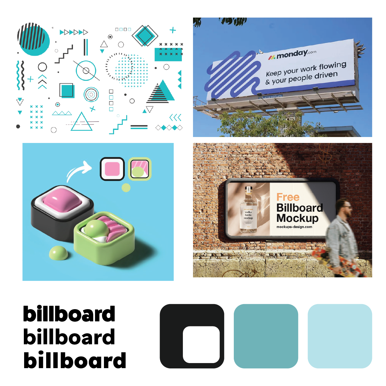
Mood Board
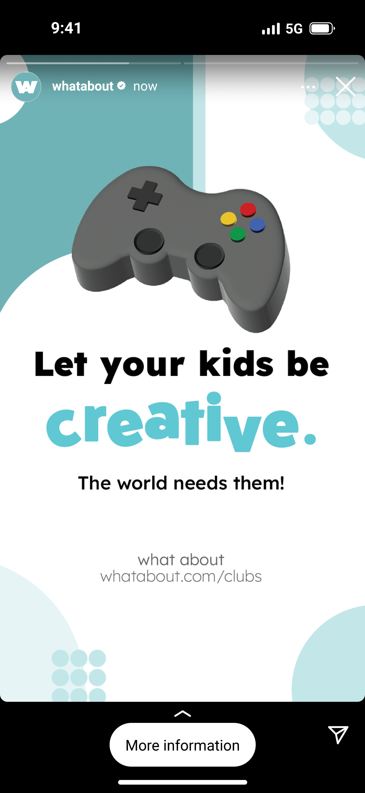
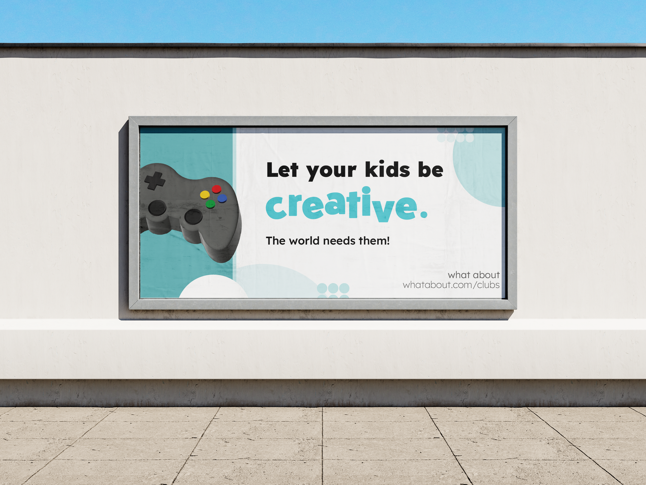
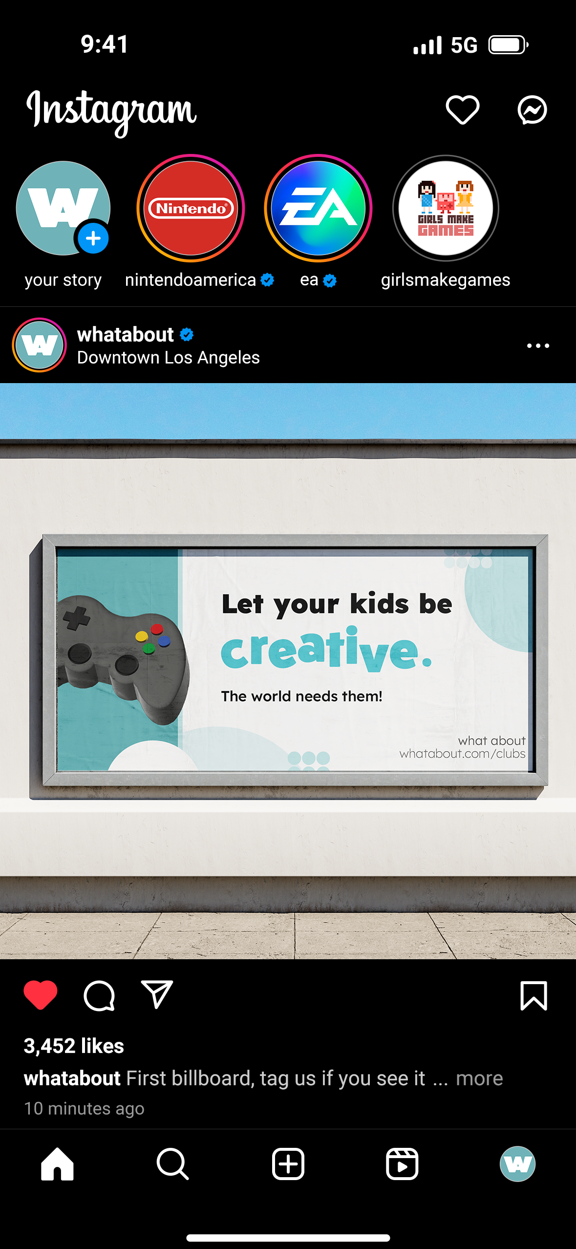
The moodboard for the “What About” Program was developed specifically to support a billboard-focused branding project, so the visuals emphasize large-scale impact, legibility, and strong graphic presence. The board features patterns, billboards, and bold environmental graphics—all chosen to mirror the environments where the brand would appear in real life. These references helped shape a system that feels visible, assertive, and modern, reflecting the program’s mission to bring attention to creative and lesser-known academic paths.
The color palette revolves around deep charcoal grey, a rich turquoise, and a lighter blue-green variation of that same tone. These colors were selected for their high contrast and clarity at large sizes, ensuring that messaging remains readable from a distance. The turquoise tones introduce energy and curiosity, while the dark grey grounds the brand in professionalism and credibility—balancing youthful creativity with a sense of seriousness and importance.
Typography choices reinforce this need for clarity. Clean, geometric sans-serifs were selected for their legibility on billboards and other large-format designs, while still feeling fresh and contemporary for younger audiences. Together, the imagery, color palette, and type system create a visual direction that is bold, engaging, and built for visibility, supporting a brand designed to help students imagine possibilities beyond the expected.
Conclusion
The “What About” Program brings together billboard design, branding, and social media exploration to create a cohesive visual identity that champions creative and lesser-known majors. By combining bold colors, clear typography, and large-scale graphics, the project highlights the importance of visibility and representation for students exploring non-traditional paths. The final billboard encapsulates this mission—serving as a strong, public reminder that every future deserves to be seen.
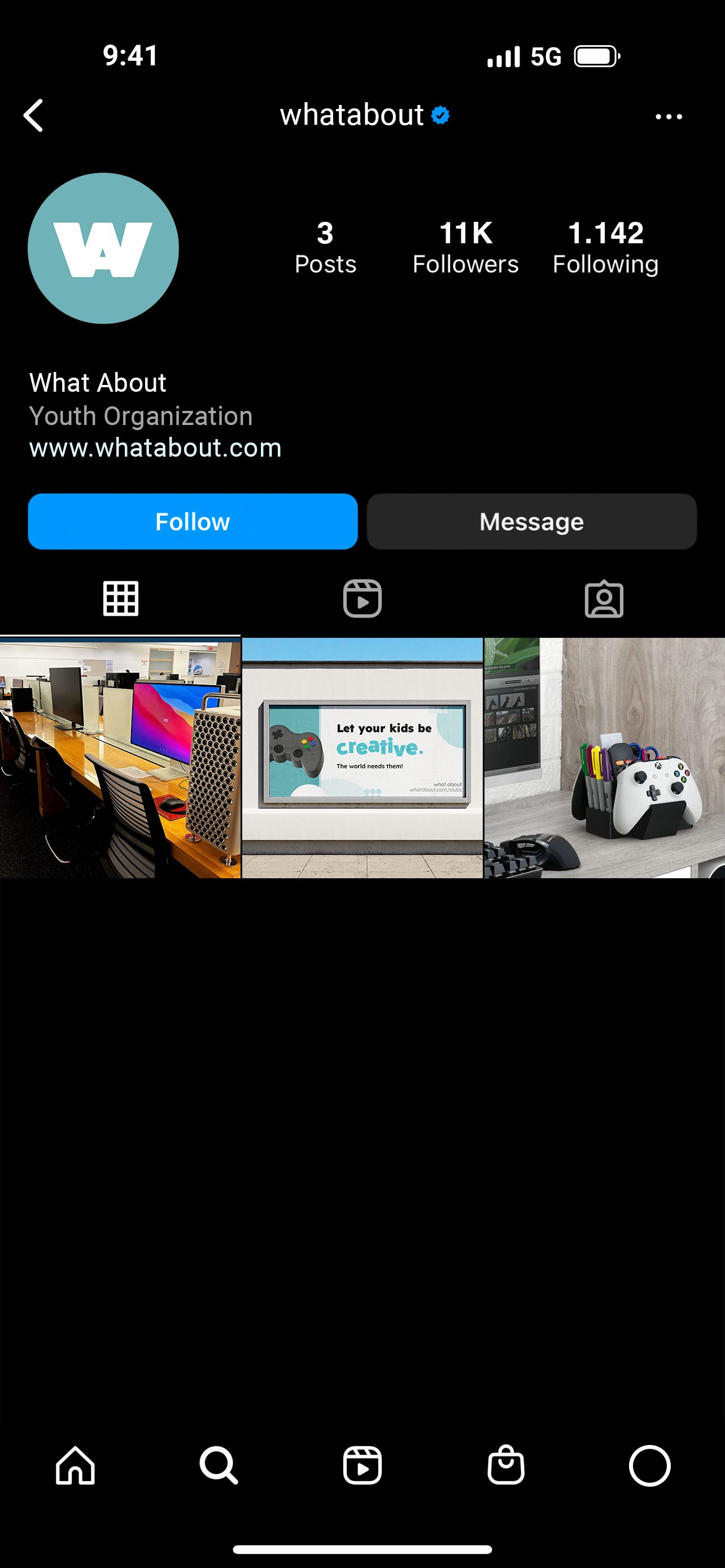
Social Media Exploration
To expand the brand beyond the billboard, I created a mock Instagram account featuring sample posts that translate the visual identity into a digital format. These posts use the same deep charcoal, turquoise, and light blue-green palette, along with bold patterns and simple typography, to keep the brand consistent and recognizable. The mock feed shows how the “What About” Program could connect with students on platforms they use daily, making creative and lesser-known majors feel visible, relevant, and engaging.